
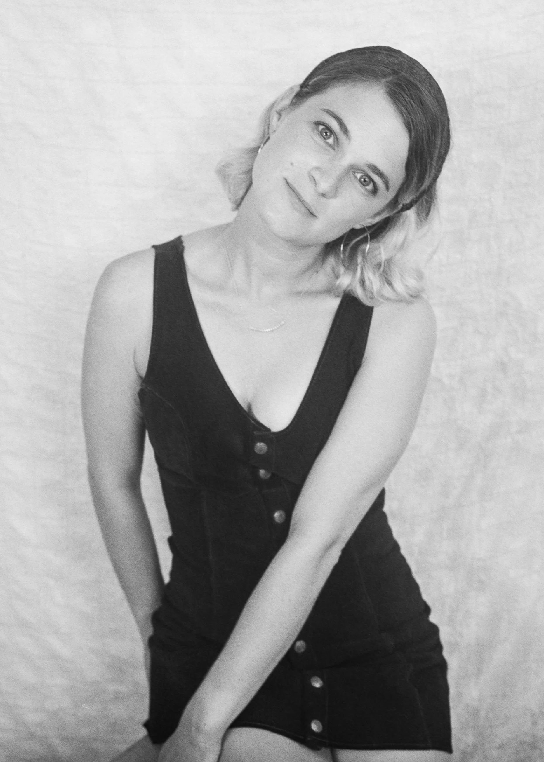
Black-and-white portraits like this work because they do not hide behind extras.
No trend-forward color. No loud set. No “look at the styling” distractions. Just Dana, a clean backdrop, and a kind of expression that feels calm and knowing at the same time.
This is the kind of portrait that stays interesting because it is built on presence, not production.
Why black-and-white keeps winning
Color can be beautiful, but it can also turn into noise.
When you strip it away, the viewer pays attention to what actually creates connection:
the softness around the eyes
the shape of the light on the cheek and collarbone
the tiny shift between “posed” and “real”
the way someone holds their own gaze
Black-and-white is not automatically serious. It is just honest. And honesty photographs well.
What makes Dana’s portrait feel so alive
A few quiet choices are doing a lot of work here:
Simple styling: The dark dress creates clean lines and lets the face lead the frame.
A relaxed posture: The body is at ease, which makes the portrait feel human instead of “performed.”
A slightly off-center tilt: That small angle adds personality and softness without trying too hard.
Texture + grain: The film-like feel makes the image more tactile. It reads like memory, not content.
The result is a portrait that feels approachable and striking at the same time.
Closing thought
The best portraits are not the ones where someone looks perfect.
They are the ones where someone looks recognizable.
If you want images that feel timeless and true (and still a little editorial), black-and-white will always deliver.